Detect small memory leaks


TLDR;
Story of how I wrote perfetto trace analyzer which verifies the absence of memory leaks in Mapbox Navigation SDK.
Introduction
Regular Android applications don’t live long.
Users switch between them and OS kills unused ones.
Even if an application leaks a little memory, it usually doesn’t cause a crash with OutOfMemoryException (OOM).
Some Android applications do live long. I had a case with a navigator app that uses Mapbox Navigation SDK. The app was always in the foreground. Even a small memory leak could cause OOM after a day, a week, or a month.
Detect small memory leak
Small memory leaks reveal themselves in constant memory growth over a long time. It’s not easy to detect it. It’s even harder to prove that there are no memory leaks.
I started by gathering information about the app’s memory usage.
Record long traces
I tried recording a long trace in Android Studio’s profiler, but it didn’t work out. Android Studio becomes completely unresponsive after a few hours of recording. You don’t need any external tool to record memory traces. Android has supported the system’s trace recording since version 9.
Prepare your phone for long traces. Make sure it has some available space in memory. Increase max trace size and length. Record only memory-related activities to reduce trace file size.
Feel free to split the trace into a few files. Stop recording and start it again. I will show you later how to concatenate a few traces.
Analyze trace
Download the trace from the phone and open it using perfetto trace viewer.
Scroll the list and find your process. I usually press ctrl+f and write the application package name. Find the RSS chart of the process, it’s a physical memory used by a process. Read this to know more about other values.

I’m looking at this chart… and… I don’t know if there is a memory leak🥲. RSS jumps up and down, even if there is a small memory growth it’s easy not to notice it.
Draw a chart
Let’s try to draw a readable chart. Perfetto provides instruments for trace analysis. I’m going to use queries and batch processor.
Based on examples and docs I built the following query to receive RSS over time:
select c.ts / 1000000 as timestamp, c.value / 1000 as rss from counter as c left join process_counter_track as t on c.track_id = t.id left join process as p using (upid) where t.name like 'mem.rss' and p.name like '{packageName}' order by c.ts
I have 36 hours of traces. I stopped and started recording again a few times to analyze the intermediate result. So it’s not a single 36 hours trace, it’s 3 traces of around 12 hours each.
Use the batch processor to process a few traces in parallel. Open all traces from the folder with traces.
files = glob.glob(f'{tracesFolder}/*.perfetto-trace')
if (len(files) == 0):
    print(f"no trace files found in {tracesFolder}")
    exit()


print("loading:" + ' '.join(files))
with BatchTraceProcessor(files) as btp:
Request memory usage over time from each of them.
rssMemorySets = btp.query(f"select c.ts / 1000000 as timestamp, c.value / 1000 as rss from counter as c left join process_counter_track as t on c.track_id = t.id left join process as p using (upid) where t.name like 'mem.rss' and p.name like '{packageName}' order by c.ts")
The batch trace processor returns a list of results, 1 result per 1 file. Contact memory usage from different files and order by time:
rssMemory = pandas.concat(rssMemorySets)
rssMemory.sort_values(by=['timestamp'], inplace=True)
Draw a chart with memory usage.
rssMemory.plot(x='timestamp', y='rss')
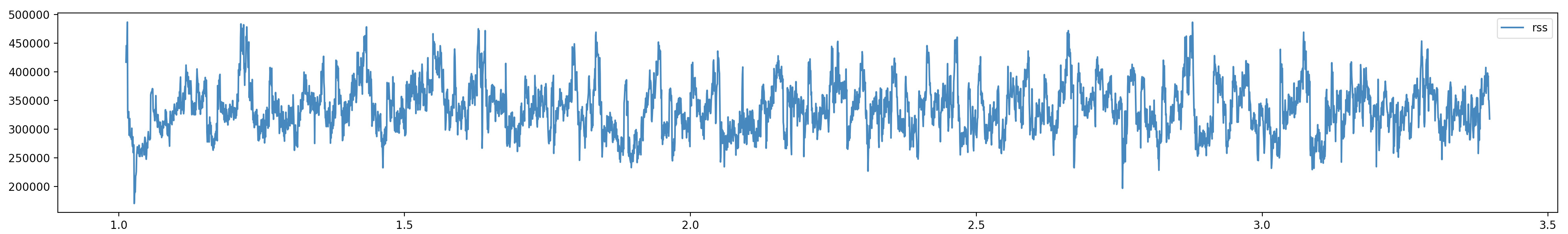
That’s better but… it’s still arguable. Some people may say that chart is okay, some might see a leak. Does it look okay to you?
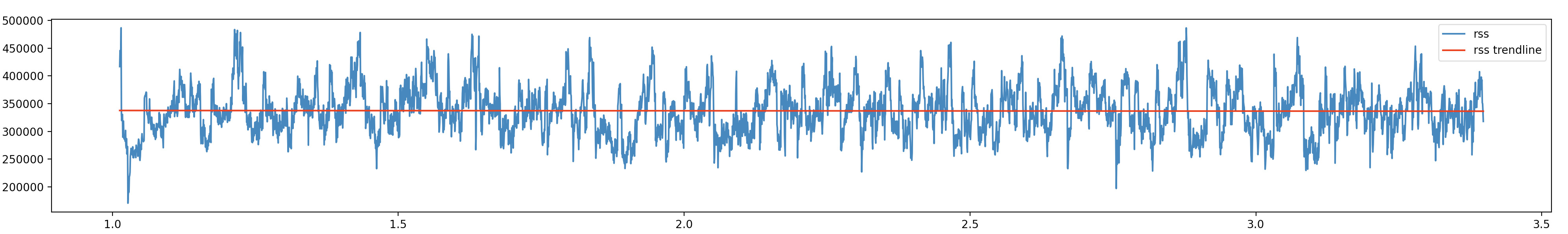
Trend line
The linear trend line may suggest how a value is going to change in the future. Let’s draw it to see if RSS is slowly growing.
It’s time to remember some math from school.
A linear function can be defined by the equation y = b * x + c.
Polyfit function will help you find b and c for the trend line.
Pass your x(timestamp), y(memory), and 1 as a degree and you will get an array of [ b, c ].
If coefficient b(first element of the array) is less than 0 trend line is decreasing, otherwise increasing.
def drawTrendLine(dataFrame, xKey, yKey, color, label):
  ts = pandas.to_numeric(dataFrame[xKey])
  mem = pandas.to_numeric(dataFrame[yKey])
  coefficients = np.polyfit(ts, mem, 1)
  b = coefficients[0]
  print(f'{label} has coefficient {b:.20f}')
  p = np.poly1d(coefficients)
  plt.plot(ts, p(ts), color=color, label=label)
  plt.legend()
I have rss trend line has coefficient -0.00000548365707914431 in the output.
It means that the trend line is flat.
Take a look at the trend line to check if the RSS values follow the calculated trend line.
Thank you for reading
You can find the whole script on Git Hub.
If you have a similar problem, do not be afraid to write a custom tool. It’s easier than it seems, at least when you do it for the second time 😅.